ADMIXTURE GENETICS RESULTS IN A WORLDWIDE CONTEXT – A COLLABORATION WITH THE UNIVERSITY OF TEXAS AT TYLER.
One of ADNTRO’s main features is describing your ancestral makeup of every individual as well as to leverage their genetic information with the results from a curated selection of Genome Wide Association studies that are available (GWAS), which help you to unlock the stories your genetic code has to tell..
This methodology is based on a Nature publication (one of the most prestigious scientific journals in the world) and the 1000 Genome database which does not allow us to provide the detailed country breakdown from your ancestry calculator in ADNTRO, but it is a very robust method with a solid scientific basis.
To achieve the description of the ancestry composition, we use computational pipelines (workflows for "big data" - large data sets - that use the computational power of Google Cloud) to compare your DNA with that of many other individuals around the world, in this case using the 1000 Genome database as a starting point, which comprises 2,504 genetic profiles of anonymous individuals from 26 different world populations (see the additional information section below for more details).
Based on your genetic similarity, to others in these databases, the computer pipelines make predictions about how much of your ancestry comes from different places around the world..
Missing from this endeavour, however, is how to put your results into the context of other populations. How similar is your DNA profile to that of people from your part of the world and to that of people from other parts of the world? Many people around the world have ancestries that are unique to the region where they are from, but many others also have mixed ancestries that may reflect human migration patterns in the distant past or in recent times (such as having a parent from a different country or even a different continent).
ADNTRO has collaborated with the Dr. Joshua Bantaa professor of Biology at the University of Texas at Tyler who studies and publishes about the genetics of natural populations, using big data to make a visual tool available to you that puts your genetic results in a worldwide context. This tool is based on your own DNA, combined with the ‘1000 Genomes’ database of worldwide genetic diversity, comprising 2,504 anonymous individuals’ DNA profiles from 26 different worldwide populations (see “additional information” section below for further details)..
Now for the gritty details. We use a non-negative matrix factorization algorithm (sNMF) implemented by the 'snmf' from the LEA package package in the open source statistical program R. This algorithm estimates the contributions to the genome from hypothetical ancestral groups of every individual in the analysis, based on the genetic similarities/differences of the DNA sequences to one another. For further details on the methods, see “additional information” section below.
To find the optimal number of ancestral groups (K), different numbers of hypothetical ancestors were simulated, and the different simulations were compared to one another to determine which one fits the data the best and, therefore, which number of K groups should be used for further purposes. We tried different numbers of K groups ranging from 5 – 12 using the snmf function’s entropy criterion that evaluates the quality of fit of the statistical model to the data using a cross-validation technique ((see "Additional information" section below (1)).
A model with a certain number of K groups is favoured when the entropy criterion is minimized (see "Additional information" section below (2)).
Based upon these criteria, we find that the optimal number of K groups is 5, meaning five different main ancestral groups (Figure 1).
For more details about the methods, you can consult the additional information at the end of the article).
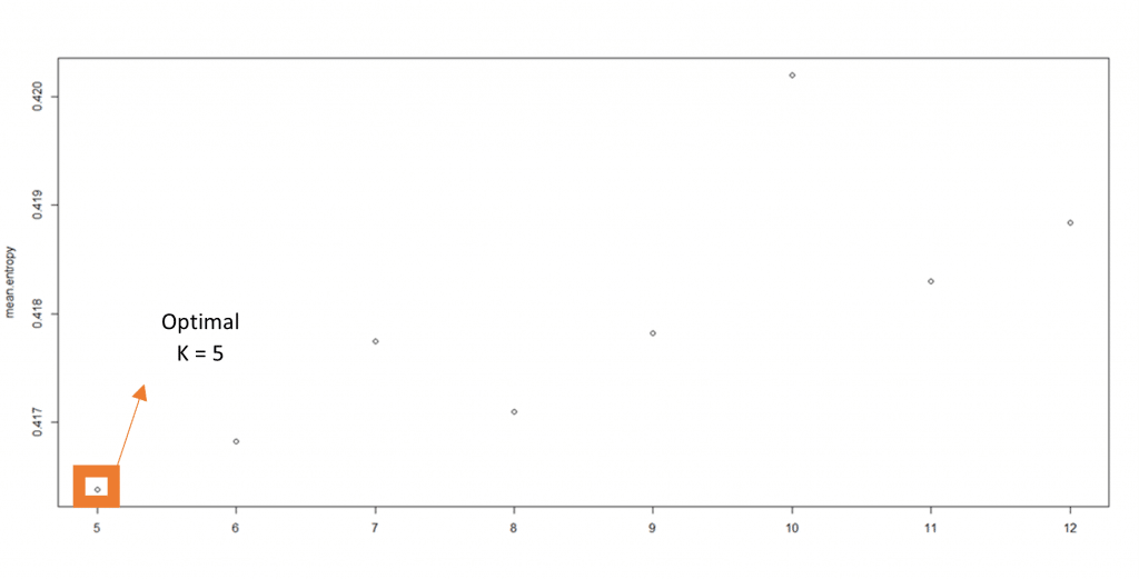
Figure 1. The number of ancestral groups is optimal for a value of five. At five the entropy is minimized being five the K value for which our data fits best.
YOUR COMPOSITION OF ANCESTRALITY AT THE GEOGRAPHICAL LEVEL
These five ancestral groups can be visually described as ancestors from Africa (represented in red), Amerindian (represented in green), Western Eurasia (represented in light blue), East Asia (represented in yellow) and South Asia (represented in orange).
To obtain the contribution of these ancestral groups in your DNA, we run the analysis with the 1000 Genomes data along with your data to generate results that include your ancestry in a global context.
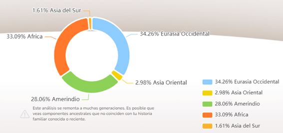
Figure 2. Diagram showing a breakdown of the five major components and their percentage.
With this graph you will be able to see more clearly the pattern of the ancestral groups, that is, the contribution of the different ancestries to your DNA and to the rest of the 1000G populations. You will also be able to know how similar you are to the different 1000G populations (Figure 3).
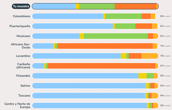
Figure 3. Diagram showing the breakdown of the five major components and the genetic similarity to the different 1000G populations.
Each multicolored segment represents a major component. The individual in this example has mixed colors due to small amounts of mixed ancestry. Interestingly, the genetic profiles of the peoples of the Americas have the greatest variability.
There are many individuals who have substantial ancestry associated with Western Eurasia (light blue), as well as substantial contributions associated with African ancestry (red). This reflects the complex history of African peoples with the slave trade and with the peoples of the Americas, where indigenous people intermingled with European settlers.
Your ancestry composition shape
If you are already part of the ADNTRO community, you will know that we like to go further, be creative and offer our users innovative results. For this reason we have developed a comparative viewer of ancestral patterns based on correlations. Using data from 1000 Genomes and yours we have analyzed how similar and how different is your DNA from the "typical" DNA of the 26 different populations of 1000 Genomes.
Looking your similarity/ dissimilarity with them and “painting” what we call “your ancestral shape”.
At ADNTRO we like to offer new angles and innovate, always keeping in mind the importance of understanding your DNA as a whole; this is what allows you to obtain your ancestral pattern and compare it with different ancestral patterns worldwide. Something unprecedented in the world of genetic test direct to the consumer today.
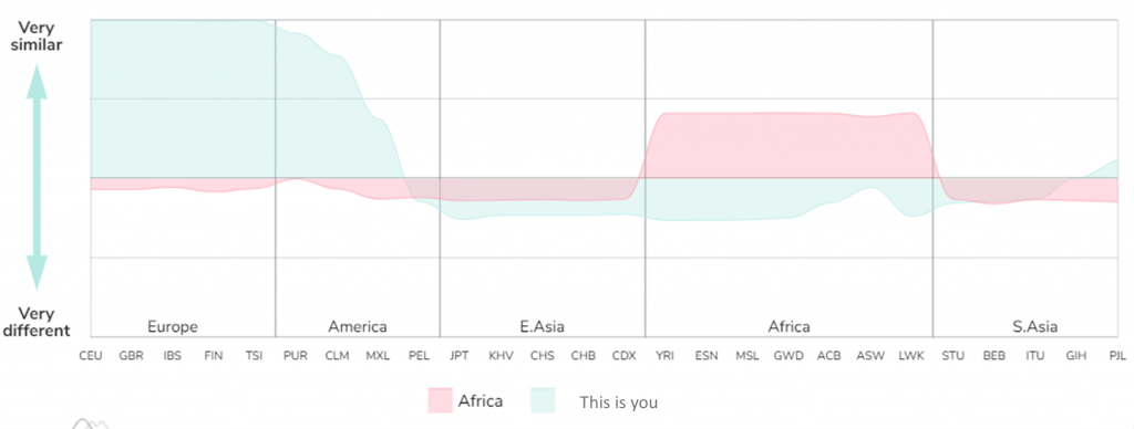
Figure 4. A comparative between the “typical” African shape and yours. This plot is an example where we have used a European sample. Nevertheless, the shape will change according to your genetic information. At the same time, you would be able to change the reference population you want to be compared to.
Your ancestral shape is unique to you, but many other populations within the same continent will show a high overlap, this is quite normal and actually a proof of how similar we are – To allow for a better exploration beyond the 1000G populations, you can upload your ancestral shape tagged with your country of origin and a nickname and browse other shapes within the ADNTRO community, helping to share and compare your similarities and differences with the world and enjoy this fascinating journey inside your DNA.
The “ancestral shape” is free for anyone to check their results by uploading their RAW DNA data from other companies (we are compatible with most of them) and making it available for free helps us boost the reach of the scientific research and help our customers to explore their DNA like never before.
Do you like this tool? Are you curious to see your ancestral shape in a worldwide context? Do you want to compare yourself with others?
Do you like this tool? Are you curious to know your ancestral pattern in a global context? Do you want to be able to compare it with others? Enter DNATRO 😊, purchase your ancestry dna test or upload your "Raw" and discover it!
ADDITIONAL INFORMATION
(1) You can consult page 926 of the Article, in the 1st column, near the bottom of the page in the “Analysis of the Population Structure” section
(2) You can consult page 927 of the Article, at the bottom.
More details on the methods: For both, the 1000 Genomes datasets and your data, we have filtered the data to Single Nucleotide Polymorphisms (SNPs) that have exactly two alleles with a minor allele frequency of 0.05 of higher, and then we made sure the SNPs were spaced out at least 2 kilobases away from each other.
Which populations does the 1000G Project include?
- African Ancestry in SW USA [ASW]
- African Caribbean in Barbados [ACB]
- Bengali in Bangladesh [BEB]
- British From England and Scotland [GBR]
- Chinese Dai in Xishuangbanna, China [CDX]
- Northern Europeans from Utah and TSI means Tuscans from Italy [CEU]
- Colombian in Medellin, Colombia [CLM]
- Esan in Nigeria [ESN]
- Finnish in Finland [END]
- Gujarati Indians in Houston, Texas, USA []
- Han Chinese in Beijing, China [CHB]
- Han Chinese South [CHS]
- Iberian Populations in Spain [IBS]
- Indian Telugu in the UK [AND YOU]
- Japanese in Tokyo, Japan [JPT]
- Kinh in Ho Chi Minh City, Vietnam [KHV]
- Luhya in Webuye, Kenya [LWK]
- Mende in Sierra Leone [MSL]
- Mexican Ancestry in Los Angeles CA USA [MXL]
- Peruvian in Lima Peru [PEL]
- Puerto Rican in Puerto Rico [PUR]
- Punjabi in Lahore, Pakistan [PJL]
- Sri Lankan Tamil in the UK [STU]
- Toscani in Italy [TSI]
- Yoruba in Ibadan, Nigeria [YRI]
- Gambian in Western Division - Mandinka [GWD]

